In beta · Intentional growth
The Garden
The anti-pattern dating product.
// TL;DR
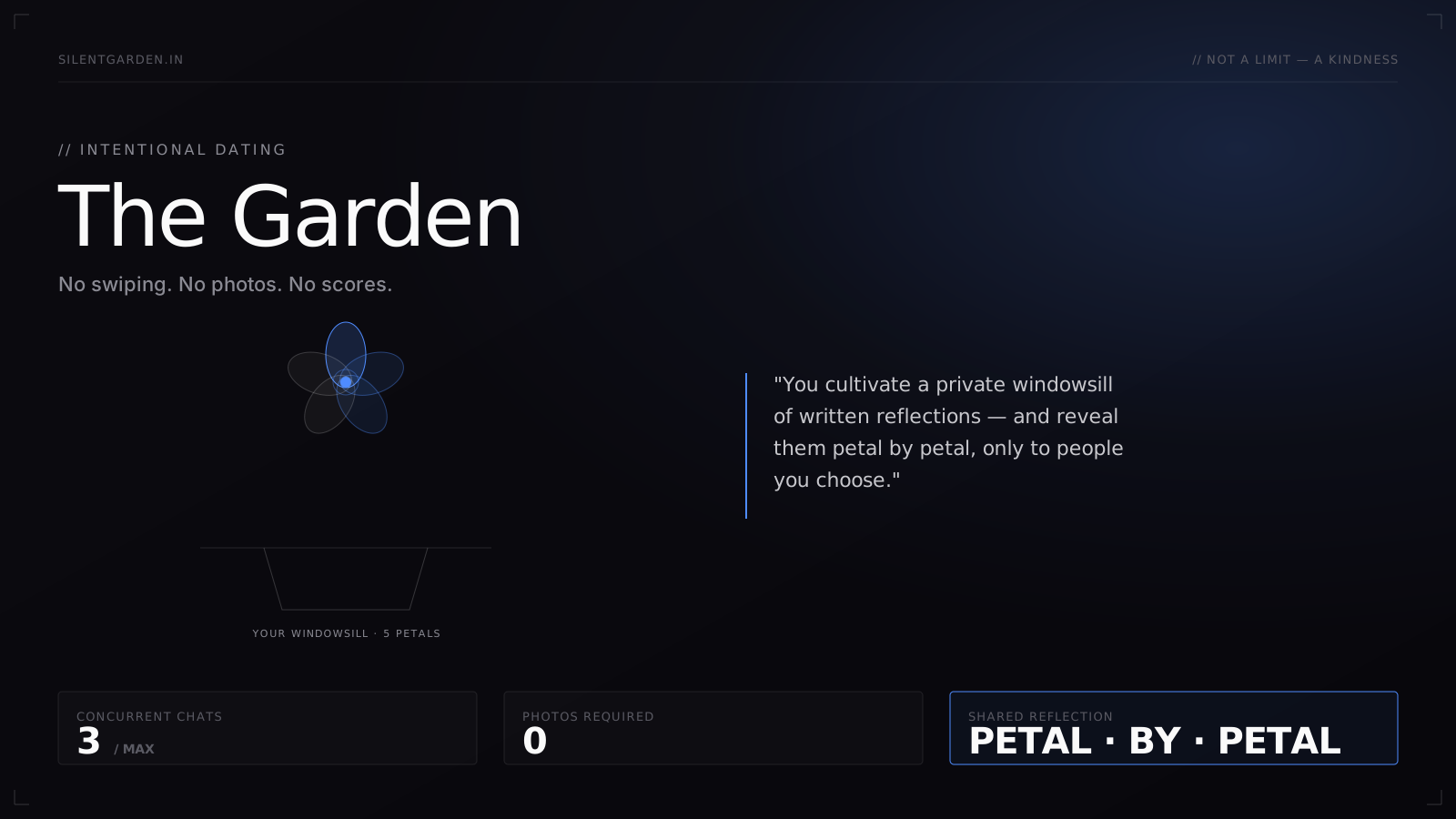
Modern dating apps optimize the slot-machine — swipes, matches, message volume — and burn their users out in the process. The Garden is the inverse: no swiping, no photos, no scores. You cultivate a private windowsill of written reflections and reveal them petal by petal, only to people you choose. A bet that intentionality has a real, monetizable audience in a category built on the opposite.
Dating apps optimize for engagement. Engagement is the wrong goal for finding a partner.
Every consumer-facing dating product I studied — Tinder, Bumble, Hinge, the Indian-market players — measures success by swipes, matches, and daily-message volume. Those metrics correlate with retention but not with the user's actual goal, which is to find one person worth investing in. The product hits its KPI by burning its user out, and "burnt out from dating apps" became its own demographic. The Garden is the bet that a sizable, undermonetized audience would prefer fewer, slower, higher-signal conversations.
Built for people exhausted by the slot machine.
The Garden's audience is narrower than mass-market dating apps, by choice. It is the people who have either left the apps or never enjoyed them, and who are willing to do more work upfront in exchange for a more humane experience downstream.
- People emerging from long-term relationships who find swipe culture jarring
- Neurodivergent users who experience rapid-fire matching as overwhelming rather than fun
- Writers, introverts, and anyone who feels their personality is the worst thing about their photo
The slot-machine metaphor came up unprompted, repeatedly.
I ran 22 interviews and a 60-response survey before settling on the product spec. Two things were striking. First, the slot-machine analogy came up unprompted in more than a third of the interviews — users describe the product as a behavior they can't put down, not a service they enjoy. Second, the desire for a slower, more deliberate interaction was bipartisan across age, gender, and city tier — it wasn't just an introvert's gripe.
// Signals
- 8 / 22 interviewees used the phrase "slot machine" or "compulsive" without prompting
- 78% of survey respondents (n=60) preferred fewer, higher-quality conversations to more matches
- Engagement-heavy users reported the lowest satisfaction with outcomes — the opposite of what the metric suggests
Remove the mechanics that produce the burnout. Replace them with rituals that reward patience.
The strategic thesis is that intentionality is a positioning, not a feature. To deliver it, almost every default of the category had to be inverted. No card stack. No photos as the primary signal. No "matches" counter creating social-comparison anxiety. Conversations are rate-limited by design, framed as a kindness rather than a restriction. The product's job is to slow the user down enough that the next message they send is the one they actually meant to send.
// We said NO to
- Swipes — the single most addictive interaction pattern in the category
- Photo-first profiles — the visual gate filters out personality
- Public match counts and reaction emojis — engagement candy with no compounding value
- Push-driven growth (streaks, "X people liked you", urgency CTAs) — the wrong feeling for the brand
A windowsill, not a feed.
The core metaphor is a garden. You cultivate a private windowsill of written reflections — small pieces of yourself, written by you. Each reflection is a "petal." Connecting with someone is a deliberate act of revealing petals, one at a time, to them. The other person sees you petal by petal, in the order you choose. There is no swipe; you find people through a serendipitous match tied to written compatibility, not visual screening.
Your private space of written reflections. Some are visible to everyone, some are reserved, some are entirely private. You curate this before you start meeting people.
You decide which reflections become visible to which person, and in what order. Vulnerability is a slow, intentional act — not a one-shot profile.
"Not a limit — a kindness." You can hold three open conversations at a time. The cap exists to protect attention and emotional bandwidth, not to monetize unlocks.
There is no visible like count, no match number, no scarcity nudge. The product never tells you you're being chosen by many — it tells you you're being chosen by one, deliberately.
What we deliberately gave up — and what we kept in exchange.
A higher friction onboarding hurts top-of-funnel conversion, but it filters in the exact audience the product is for. The users who survive the writing requirement are the users who deliver on the promise.
Caps lose engagement metrics on paper but preserve the experience the brand promises. They also create the only honest scarcity in the product — the one tied to real attention.
Match-count gamification creates the exact comparison anxiety users came here to escape. Removing it costs the product some "addictiveness" — which, again, is the goal.
Slower discovery is worse on a daily-active-user dashboard and better on a "did you find someone worth keeping" dashboard. The product is built for the second one.
Soft-launched. The early signal is qualitative and consistent.
The Garden is in beta. The engagement metrics are intentionally lower than category benchmarks — that's expected. What's notable is the qualitative pattern in user feedback: users describe the experience as restful where comparable products feel exhausting. Average session length is shorter than swipers, but reported satisfaction-per-session is meaningfully higher. The early adopters are exactly the audience the product spec targeted.
What I'd carry forward.
// Stack